Getting the right combination of facts and emotions, convincing the reader to take action with just a few words, and knowing your audience to the core…. B2B copywriting is hard.
While the average conversion rate for landing pages is around 3%, it drops to 2.23% when it comes to B2B landing pages. But why? When writing a B2B landing page, marketers are writing copy that targets business owners and managers looking to improve their business in some way.
It isn’t enough to simply understand your audience; this knowledge is wasted if you don’t share the information back to customers, demonstrating what you know. As well as the audience, your copy also needs to be adapted to each asset. The same message to the same person could land very differently depending on what channel you’re using to communicate it.
So…B2B landing pages.

They are often the first chance that you have at capturing your customer’s interest, and they have one goal: traffic conversion – whether it means a purchase, downloading a report, or making an inquiry. B2B landing pages focus on one CTA, so these pages have limited navigation, to remove any unnecessary stimulus, and keep the customer’s attention on the goal.
With 80% of a mobile visitor’s attention being spent at the top of the page, your job when writing copy for B2B landing pages is to convince the customer to take action in a concise, clear, and direct way.
There are many ways to achieve this, and we have put together a quick checklist of the main common denominators when it comes to writing killer B2B landing page copy:
- They paint an ideal scenario with your product or service e.g. “Reach new customers with targeted ads.”
- They focus on the offer, not the company – making it about what it’s in for the customer, not how great they are
- They are specific to the audience
- They include one clear call to action (CTA)
- They use active voice
- They provide proof: Social proof, FOMO, testimonials, reviews, awards, and more
- They use power words that trigger an emotional response (either positive or negative), so they should be used with caution. Some examples of power words are:
- Boost
- Brutal
- Fed up
- Bold
- Painless
- Genius
- Sneak Peak
- Hack
- Luxurious
Whether you’re looking for inspiration, B2B writing techniques, or just a few quick tips, here are 10 B2B landing page examples with supreme B2B copywriting.
1. HubSpot
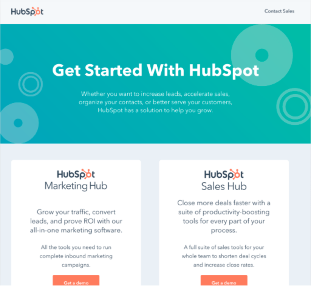
How do you tell prospective users about your B2B tool if you don’t know who they are or why want it in the first place?
Many SaaS platforms have multiple different target audiences and use cases – meaning it would take up a lot of space on the B2B landing page to explain every single relevant point for each prospective customer.
Rather than go into grand detail about how all different customer segments can use their software, HubSpot created one short B2B landing page to direct each segment to their own personalised demo. Short and sweet, direct and makes each segment feel as though you are tailoring content just for them – taking the guess work out of choosing HubSpot.
Best practice to takeaway: segment your leads with individual B2B landing pages.
2. Zoho
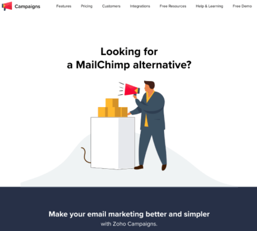
When choosing the right B2B tool for their organisation, business leaders rarely make a purchase based on the first page they see.
Choosing a tool is an investment after all, so most leads will want to be thorough in their due diligence, researching all available options before making a final decision.
That’s why, in today’s saturated market, competitor B2B landing pages have become a thing.
But how does it work? Organisations can bid on a competitor’s keyword or brand name using Google Ads, and create a B2B landing page that directly compares your product or service to the organisation visitors are actually searching for.
On our list of B2B landing page examples we have Zoho, whose B2B landing page will come up when users search for “Mailchimp alternatives,” for example.
You can’t use competitor names in your ads of course (we don’t want a legal battle on our hands), you can, however, use them at the top of your B2B landing page to help make the page more relevant (and bring search score up).
Best practice to take away: use landing pages to target your competitors.
3. Blink
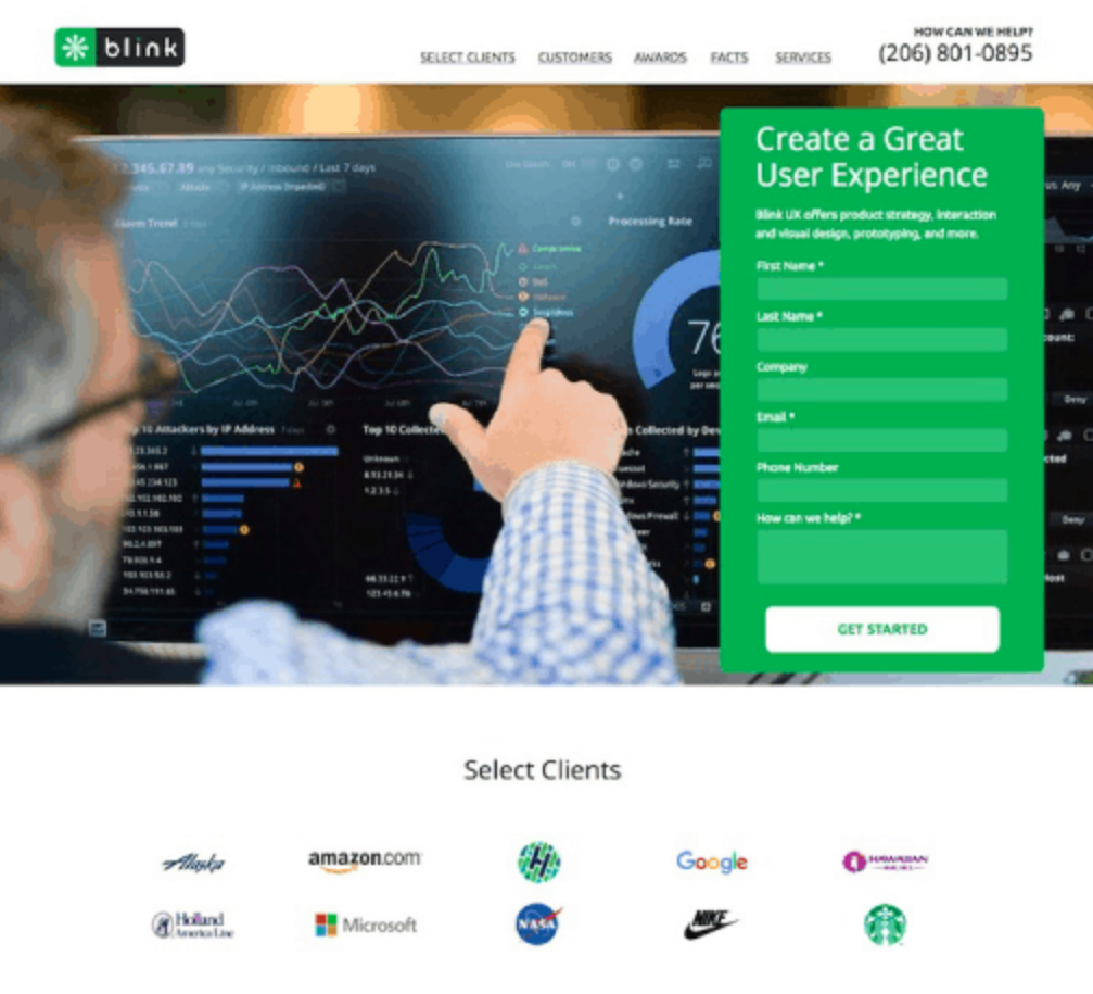
B2B landing pages with social proof and testimonials are important – so let’s take a closer look why Blink made it onto our list of B2B landing page examples.
It shows three different types of social proof the company crammed onto its B2B landing page to persuade visitors just how good their product is.
First, users see the logos of some of their “Select Clients”, which include heavy-hitters like Google, Starbucks, and NASA (how impressive is that logo bar?)
The B2B landing page shows testimonials from other satisfied clients too, and finally, Blink details some of the industry awards they have won over the years to go out with a bang.
Including one or two testimonials can be helpful, but when a company includes this much social proof, it creates a bandwagon effect that’s hard to resist.
Best practice to takeaway: include the right kind of proof to build trust and credibility.
4. Reachdesk
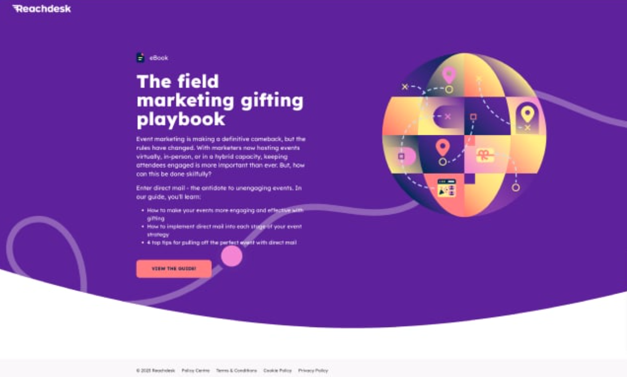
As a business, Reachdesk is all about data-driven gifting to create deeper connections in marketing, and they’re committed to creating zero waste in the future of gifting.
This is one of our favourite examples, as Reachdesk demonstrates one of the golden rules of high-converting B2B landing pages: by creating engaging and well-targeted high-value content, your audience will want to click your CTA ASAP.
Reachdesk draws in the right crowd for their business model by talking about the comeback of event marketing and how gifting can make events even more impactful.
Best practice to takeaway: put your high-value content front-and-centre.
5. Research Guru
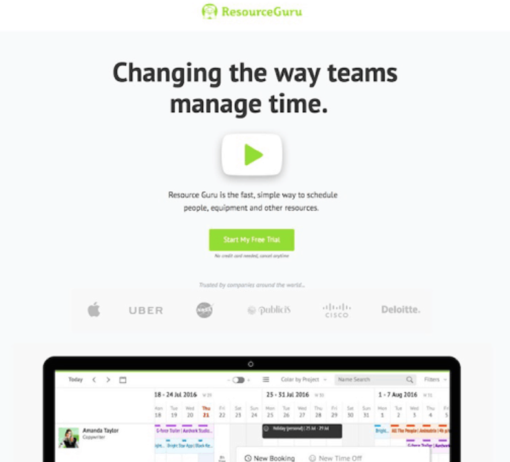
It goes without saying that many B2B products and services solve complex problems.
And it is because of this, that B2B landing pages need to be created so that customers understand features and benefits easily.
One way to do this is to incorporate visual elements like tech explainer videos, images and even animations that not only help drive conversions, but are also a lot more engaging than copy alone.
Resource Guru’s landing page greets viewers with a large play button as soon as they arrive on the page.
In this instance, pressing play is intuitive and launches a high-quality tech explainer video for users. The video does the talking, then quickly requests an action from visitors.
However, it’s important to note that even with visuals, it’s a good idea to reiterate the core points from the video script onto B2B landing page copy as well. This means, even if the video gets a low play rate, prospects can still learn about your offer without having to click play.
Best practice to takeaway: help prospects visualise a complex idea with a tech explainer video.
6. Mailchimp
Mailchimp does it right: the B2B landing page copy tells you exactly what you can expect out of the product, in a concise way, and with a clear CTA.
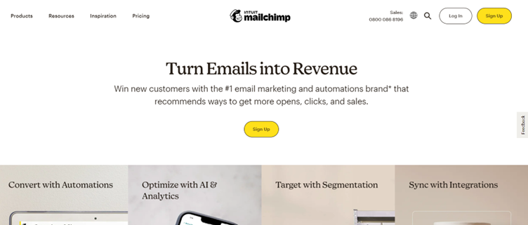
- They paint an ideal scenario with their product or service with “turn emails into revenue”
- They focus on what it’s in for the customer (“revenue”)
- They are specific to their audience – they know their need for metric improvement and explain how they meet them with the line that it “recommends ways to get more opens, clicks and sales”
- They include one clear CTA
- They use active voice
- They provide proof: “The #1 email marketing and automation brand*”
- They use the power word “win”
Best practice to take away: B2B copywriting should be simple and clearly state what the product is
7. Canva
Canva’s B2B landing page hits the nail on the head in just 3 sentences: it’s inspiring, it’s concise, and it’s persuasive.
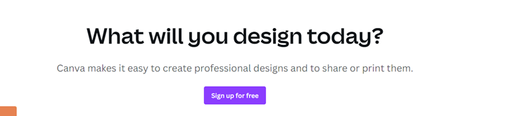
- They paint an ideal scenario with their product by implying that the reader will design something today
- They focus on what it’s in for the customer, which is easy graphic design tools
- They are specific to their audience – they know creating, sharing, and printing designs is a customer pain point, and they promise to simplify the process
- They include one clear CTA
- They use active voice
- They don’t provide proof. Instead, they reassure the reader through a simple and practical message
- They use the power words “easy” and “free”
Best practice to take away: Rhetorical questions are a great persuasion, inspiration and motivation technique
8. Shopify
Shopify’s B2B landing page couldn’t be simpler, which is in line with its brand that promises an easy selling experience for online businesses.
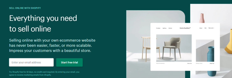
- They paint an ideal scenario with their product or service with “impress your customers with a beautiful store”
- They focus on what it’s in for the customer (“everything you need to sell online”)
- They are specific to their audience – they know their pain points and position the platform as a solution by stating “selling online with your own eCommerce website has never been easier, faster or more scalable”
- They include one clear CTA
- They use active voice
- They provide proof by offering a free trial
- They use the power words “easier”, “faster”, and “beautiful”
Best practice to take away: Balance facts and emotions, e.g. keep your message inspiring with words like “impress” or “beautiful”, but back it up with goal-oriented terms such as “scalable”
9. Mediavalet
Mediavalet’s page demonstrates that big, bold statements are bound to grab the reader’s attention, even more so for those struggling with asset visibility. The subheading provides the proof to back up the statement, and the CTA cannot be missed.
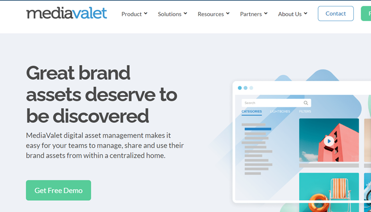
- They paint an ideal scenario with their product or service by implying they give brand assets the visibility they “deserve”
- They focus on what it’s in for the customer (easily managing and sharing brand assets)
- They are specific to their audience – they address their lack of visibility pain point, whilst promising a simplified solution for their marketing assets management
- They include one clear CTA
- They use active voice
- They provide proof through a free demo
- They use the power words “discovered” and “easy”
Best practice to take away: B2B landing pages with bold statements that tap into the emotions of the reader work great if done right (in the above case, the emotion is the injustice felt from not having the desired visibility on brand assets).
10. Jotform
Jotform’s hero copy is made up of a bold statement that is targeting a specific audience persona. Through concise sentences, it entices users to sign up in a clear and natural way.
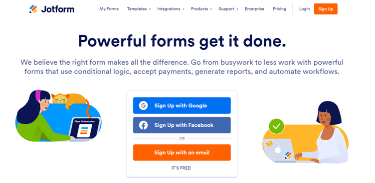
- They paint an ideal scenario with their product or service through the line “go from busywork to less work with powerful forms”
- They focus on what it’s in for the customer, including the specifics (“accept payments, generate reports, and automate workflows”)
- They are specific to their audience – they know their pain point (admin tasks needing to “get done”), and their hero copy is directly addressing it by telling them that they will do it for them
- They include one clear CTA
- They use active voice
- They don’t provide proof. Instead, they reassure the reader through a simple, yet highly specific, message
- They use the power words “IT’S FREE” to further entice the user to sign up
Best practice to take away: use easy but impactful words to communicate the pain point, value, and basic features of your product or service on your B2B landing page.
To sum up
Whatever B2B brand you are writing for, remember to keep the user at the centre. Creating customer personas can help visualise your reader and their needs, in order to create targeted B2B copy. Use personas along with other techniques like active voice, power words or social proof to strengthen your writing, and above all, remember to keep it simple.
If you’re looking for more B2B landing page examples, or help writing brilliant B2B landing page copy (or any other type of B2B copywriting)get in touch with us at hello@isolinecomms.com, and together we will take your business’ copy to the next level.