B2B websites. Love to hate them, but can’t do without them.
As channels, marketing tools, and AI capabilities continue to develop at high speed, websites remain. They’re the lighthouse in the storm of content, bringing leads back safely to shore. They’re the source of truth, the place we all head to when we just want to know what a business is all about.
So why are they so hard to get right, and what can be done to make them more successful?
The common failures of B2B websites
We all know what makes a website suck.
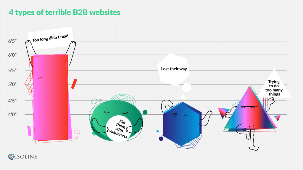
The B2B landscape is littered with examples of terrible websites, so chances are you’ve encountered one of these common types:
- The “TLDR” website. This website has more pages than a Victor Hugo novel. All of them long, jargon-filled, and impossible to read. The navigation is clunky and non-mobile friendly. However, the C-suite are convinced it makes them look authoritative so they’re reluctant to change it.
- The “Kill them with vagueness” website. This website looks the part: it’s beautiful, responsive, and has gorgeous illustrations. What’s the problem? You have no clue what the business does. It’s full of the latest buzzwords but doesn’t take the time to spell out the basics: Who are they? What are they? Why do visitors need them?
- The “Lost their way” website. This website has evolved over the years, but not in a good way. Like a bad DIY job, they’ve plastered new content over old without thinking about how everything fits together for a visitor. As a result it’s confusing to navigate and inconsistent in style.
- The “Trying to do too many things” website. Their business is complex, which is wonderful. But that doesn’t mean the reader has to find out everything they offer at once. When a landing page includes the kitchen, sink, fairground, George Clooney, and a random chicken, you know some streamlining needs to happen.
You get the picture. There are many ways a B2B website can fail to work for its audience, and getting it right is not as straightforward as it seems.
So let’s break down four key steps to creating a successful website.
1. Prioritise the customer journey
If you think about your audience at every stage of your website creation, you’re unlikely to go wrong.
Nearly 70% of the B2B buyer’s journey is completed before they even fill out a contact form, so it’s in your best interest to make that journey as smooth and relevant as possible.
For example, let’s say you’re a B2B business providing recruitment software. A basic website that should provide them with all the information they need could include:
- Home page with an overview of what the software is and its main benefits for the target audience
- Technical page with more detail about your products or services including how easy the software is to integrate with their legacy systems
- Social proof with case studies and testimonials of happy customers
- Demos and screenshots so your audience can imagine themselves using your software
- Pricing page so they know whether there’s even a chance of convincing the budget-holder
- Calls to action (CTAs), contact forms, and chatbots peppered throughout the site so that getting in touch is just one click away
- Self-service information that’s helpful to your audience, whether reports, thought leadership, or even FAQs
The list above is non-exhaustive, but features elements that work across the customer’s journey. It includes a high level overview as well as detailed information that could convince them to get in touch with you.
A customer’s journey in B2B is rarely a straightforward line from the awareness stage to the contact form. So make sure there’s plenty of high quality content available to mull over or share with colleagues. Find out how to build a content hub in our free workbook.
Tip: It should go without saying but design needs to go hand in hand with content for maximum effectiveness. Design elements should guide your visitor rather than be an obstacle. Readability is crucial, give your text room to breathe with plenty of white space.
2. Favour clear language
Website copywriting for B2B is incredibly tricky to get right. Go too far into technicalities and you risk alienating your readership. Stay too superficial and your offer will lack clarity. Where should your content sit?
It’s better to be clear than to be clever. Your audience doesn’t want to feel stupid or confused about what you’re offering. And, as it takes as little as 0.05 seconds for a user to make up their mind about a website, you don’t have time to make a second impression.
Here are some quick, real life examples of B2B headlines that strike that balance:
- “Tame your work, organize your life” (Evernote). Why? It’s straightforward and memorable thanks to the structure repeating
- “Store. Sync. Share. Sign. Simple.” (Dropbox) Why? Using punchy verbs keeps this headline action-based and practical. It also uses sibilance here for extra effect by choosing only words starting with S.
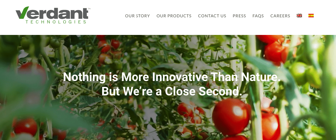
- “Nothing is more innovative than nature. But we’re a close second.” (Verdant Technologies). Why? This headline grabs attention with an intriguing premise. By agreeing to the first premise, you can’t help but want to know more about the second.
- “Medtech, modernized” (Greenlight). Why? It tells you everything you need to know in just two words, talk about powerful!
- “AI+Data+CRM = more sales and happier customers” (Salesforce). Why? It spells out the recipe of the business and its result in a very clear manner.
“Your life’s work, powered by our life’s work” (Zoho). Why? It’s aspirational but intriguing enough to keep you reading thanks to the book end of “life’s work”.
Tip: A great way to make sure your content is clear enough is to get someone completely outside of that industry to read it. Are they able to understand what your business does from the landing page? If not, you’ve got work to do.
3. Get stakeholder buy-in
All your B2B website dreams can come crumbling down if your stakeholders don’t understand the direction taken. For example, more senior members of your team might be confused as to why the language has evolved from formal to informal, from authoritative to accessible.
If you neglect an educational phase with stakeholders, you will inevitably encounter roadblocks before your launch date, resulting in delays, frustration, and wasted resources.
Anticipate this by creating resources that justify the chosen approach. From benchmarking competitors to backing up your arguments with stats, you will need to convince your team of the benefits of switching up your approach.
Here are just a few stats to help start prepping your arguments:
Why spend so much effort on improving the customer experience (CX)?
- Conversions can be 400% higher on sites with superior CX (Forrester)
- Almost 89% of visitors switch to a competitor after a poor website experience (WebFX)
What’s wrong with the messaging of the current website?
- If a visitor can’t tell what the company does, 46% of them will leave a website (KoMarketing)
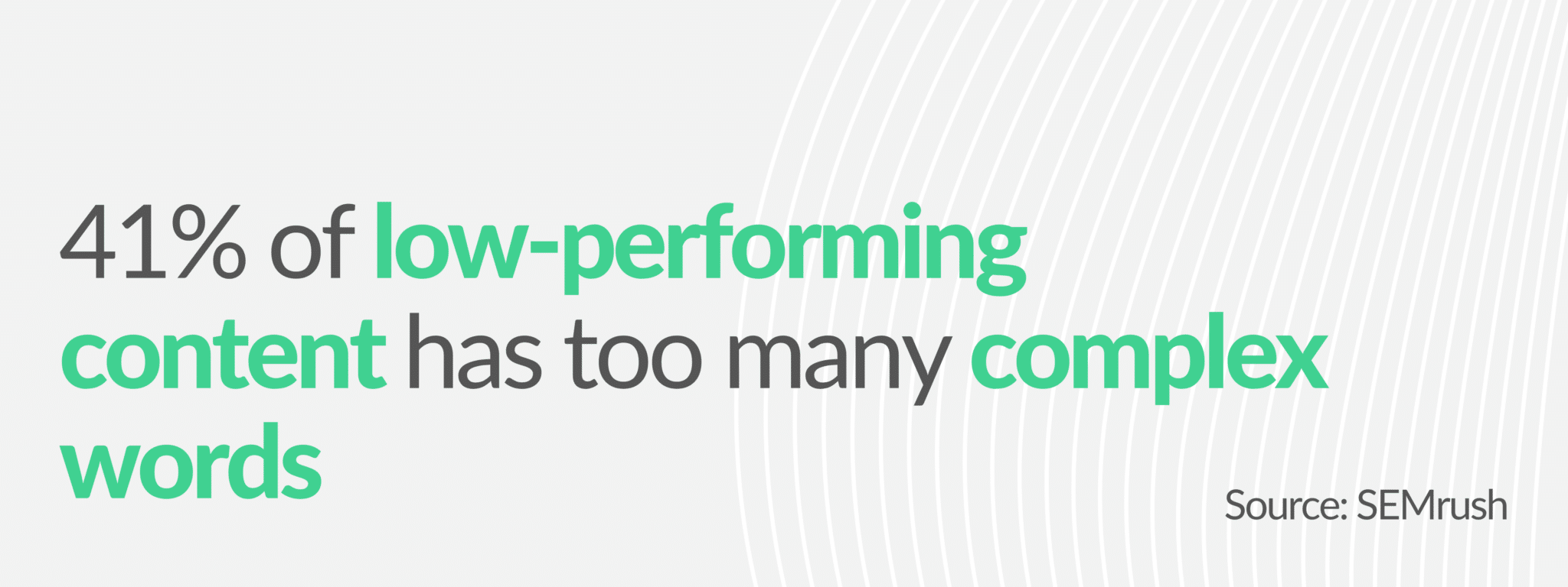
- 41% of low-performing content has too many complex words (SEMrush)
- Landing pages with less than 100 words converted better than landing pages with 500 words by 50% (Unbounce)
- 44% of low-performing content did not have any keywords (SEMrush)
The website works fine, why does it need to be changed?
- If the page loads for more than one second, the bounce rate increases by 123% (Think with Google)
- 60% of visitors won’t trust a website that hasn’t been optimised for mobile (Magnet4Blogging)
4. Use an award-winning team
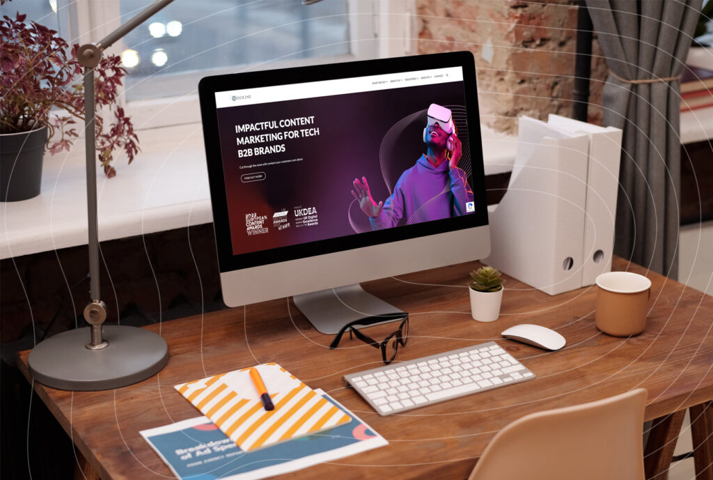
Revamping a website is a daunting task, so you could do worse than put the project in experienced hands. B2B websites are our thing. For example, we’ve recently created an award-winning website for our client that led to a 278% increase in the value of won deals.
We know how to deliver a high-conversion website from content creation to SEO optimization with minimal fuss. Best of all, we speak the language of developers so you don’t have to worry about your design and interactivity dreams getting lost in translation.
Evolution not revolution: B2B website best practice
No website is ever truly done.
Just like your business strategy, your website will need to adapt and evolve to be fit for purpose. However, optimization is much easier to achieve when there’s a healthy foundation in place, from navigation to site speed to content cohesiveness. If you need help auditing your website and setting up for long-term success, don’t hesitate to get in touch with us at hello@isolinecomms.com